USER INTERVIEW
PROBLEM SOLVING
FIGMA
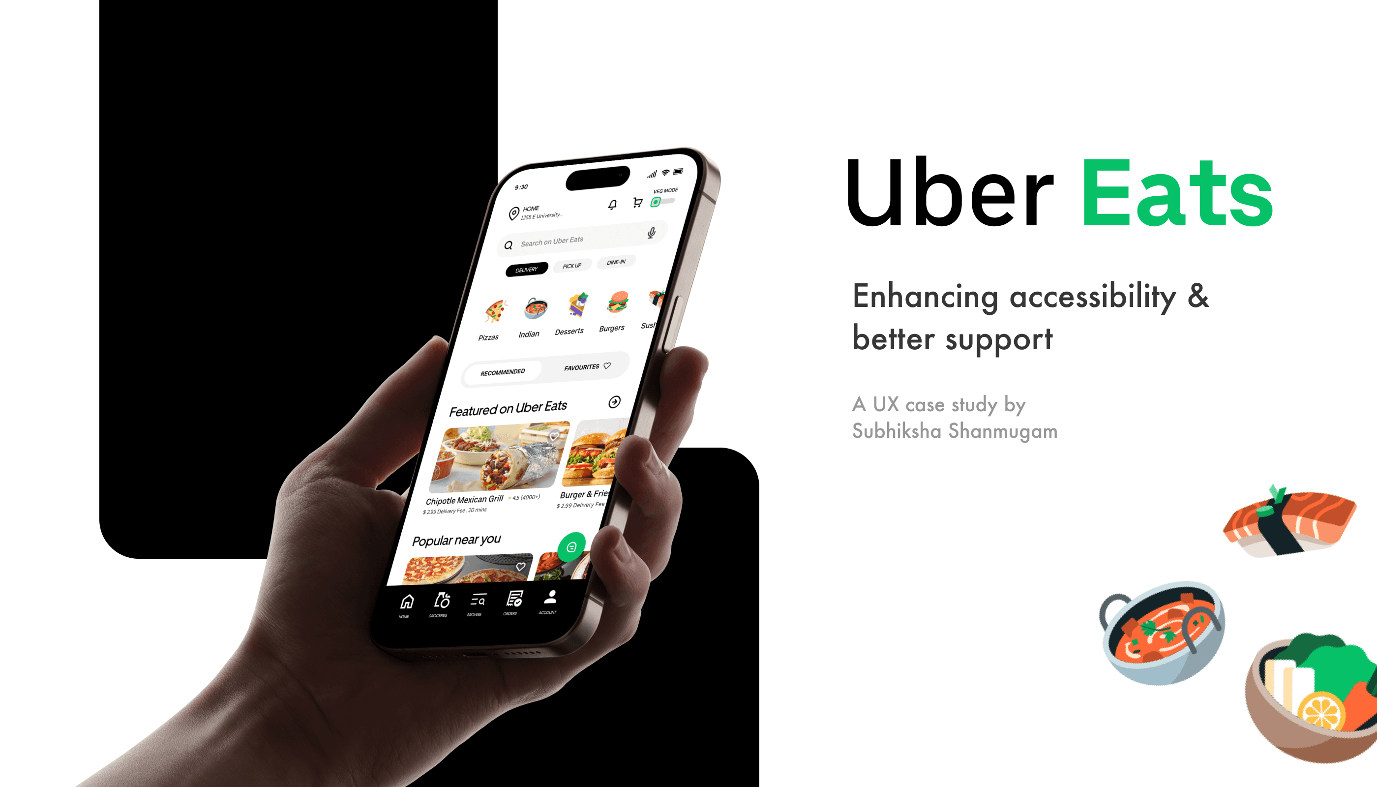
Uber Eats - Redesign
Tools :
Figma
Industry :
Tech
Project Duration :
SEPT 2024
Uber Eats - Redesign
Problem :
Uber Eats has developed a convenient food delivery platform that connects users with restaurants. However, the platform faces several usability challenges:
No vegetarian/vegan filter, lack of proper customer care solution issues, poor customer support,
and difficult-to-track saved items and orders.
These problems hinder the user experience, causing frustration and reducing customer satisfaction. As a result, Uber Eats cannot fully capitalize on its market potential and growth opportunities.
Problem :
Uber Eats has developed a convenient food delivery platform that connects users with restaurants. However, the platform faces several usability challenges:
No vegetarian/vegan filter, lack of proper customer care solution issues, poor customer support, and difficult-to-track saved items and orders.
These problems hinder the user experience, causing frustration and reducing customer satisfaction. As a result, Uber Eats cannot fully capitalize on its market potential and growth opportunities.
Solution:
After interacting with users, I realized many of them were facing similar frustrations that hindered their overall experience. To address these challenges, I designed a solution that improves food discovery, enhances customer support, and streamlines order tracking. The goal was to create a more seamless, user-friendly experience for those seeking a personalized and efficient way to order food.

Introduction
Uber Eats, a global food delivery platform, connects users with local restaurants via its app and website. As the second-largest food delivery service in the U.S., it had 11.22 million downloads in 2023, compared to 21.11 million for DoorDash. With the industry projected to reach $213 billion by 2030, Uber Eats aims to enhance convenience, personalization, and innovation to drive growth.
Scope of the Project
This project focuses on improving the user experience (UX) of the Uber Eats app, making it more accessible, intuitive, and user-friendly for a diverse audience.
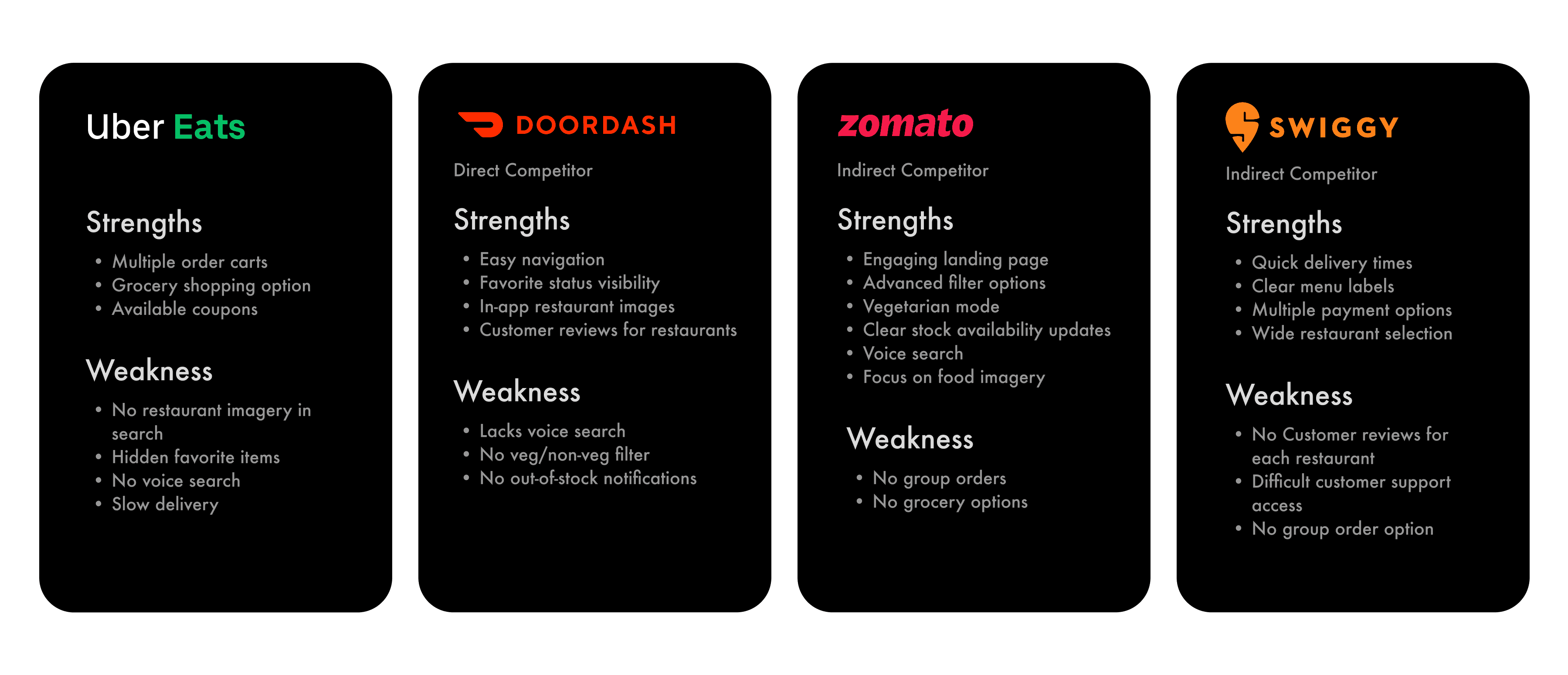
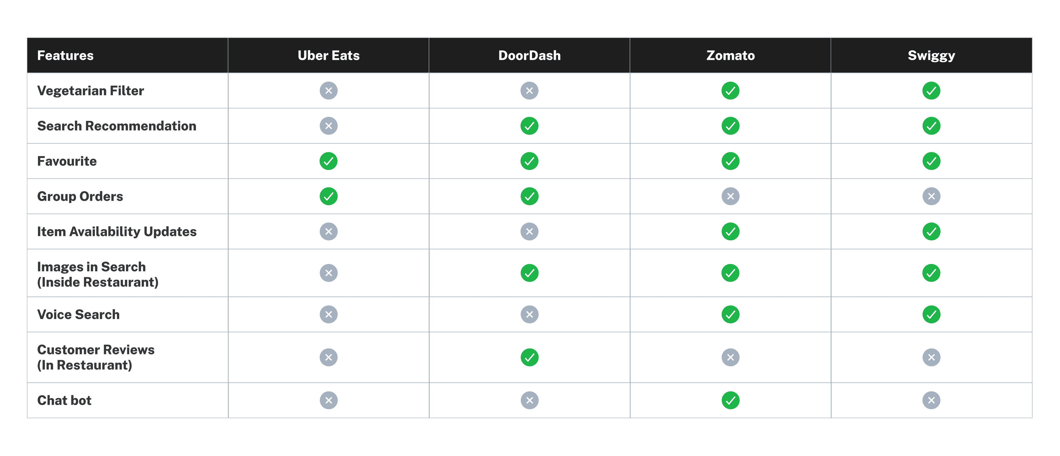
Competitor Analysis :
A competitor analysis was conducted to identify areas where Uber Eats can improve by leveraging industry best practices. This comparison provided insights into key strengths and weaknesses across competing platforms.
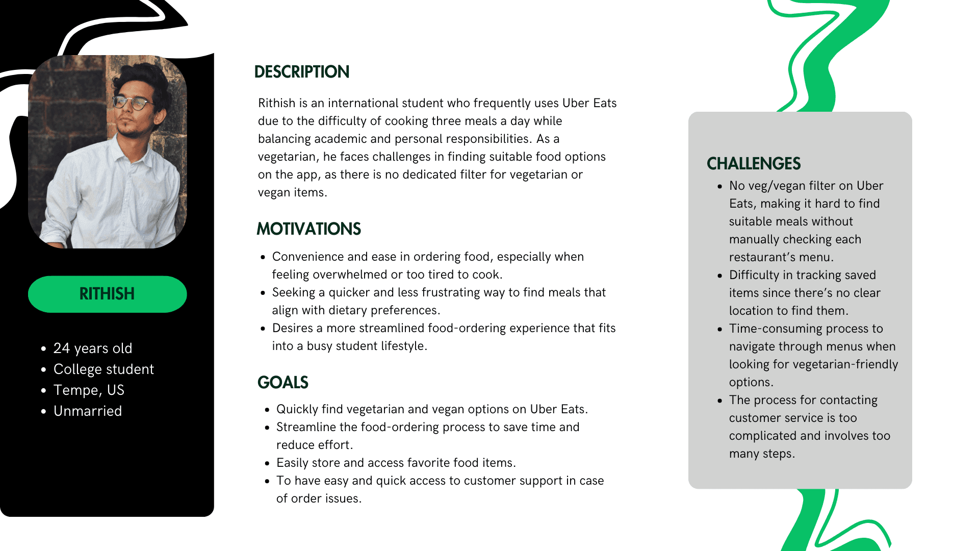
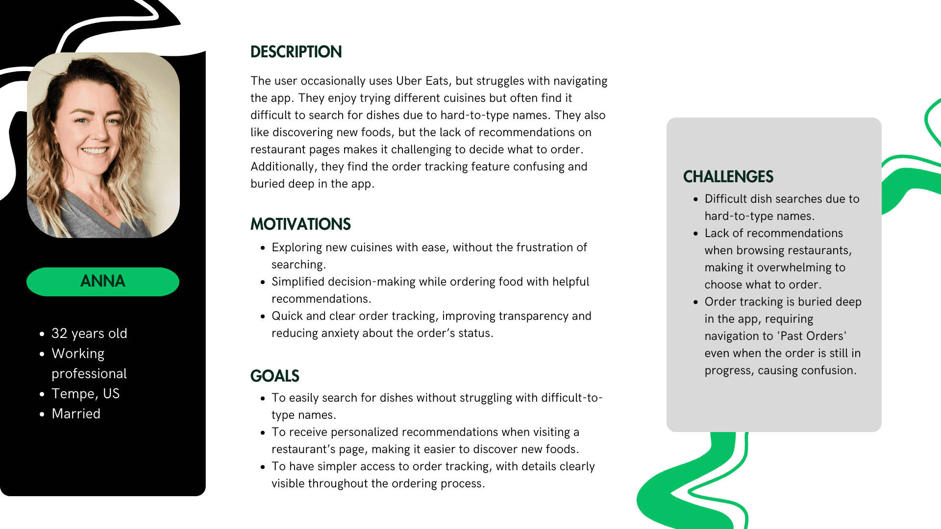
User Persona
Based on the research, I identified two distinct user personas:
A vegetarian international student who needs quick meals but has difficulty locating saved items in favorites because of an inefficient filtering system.
A U.S. citizen who enjoys exploring diverse cuisines but struggles to pronounce dish names and track orders efficiently in the app.
User Interviews
Six participants (ages 21–27), including students and working professionals, were interviewed to understand their food delivery experiences. Their feedback revealed key pain points and areas for improvement.
Key Findings
5 out of 6 struggled to find vegetarian options due to the lack of a veg/vegan filter.
4 out of 6 found saved items difficult to locate when reordering.
3 out of 6 faced order availability issues, receiving cancellations after long wait times.
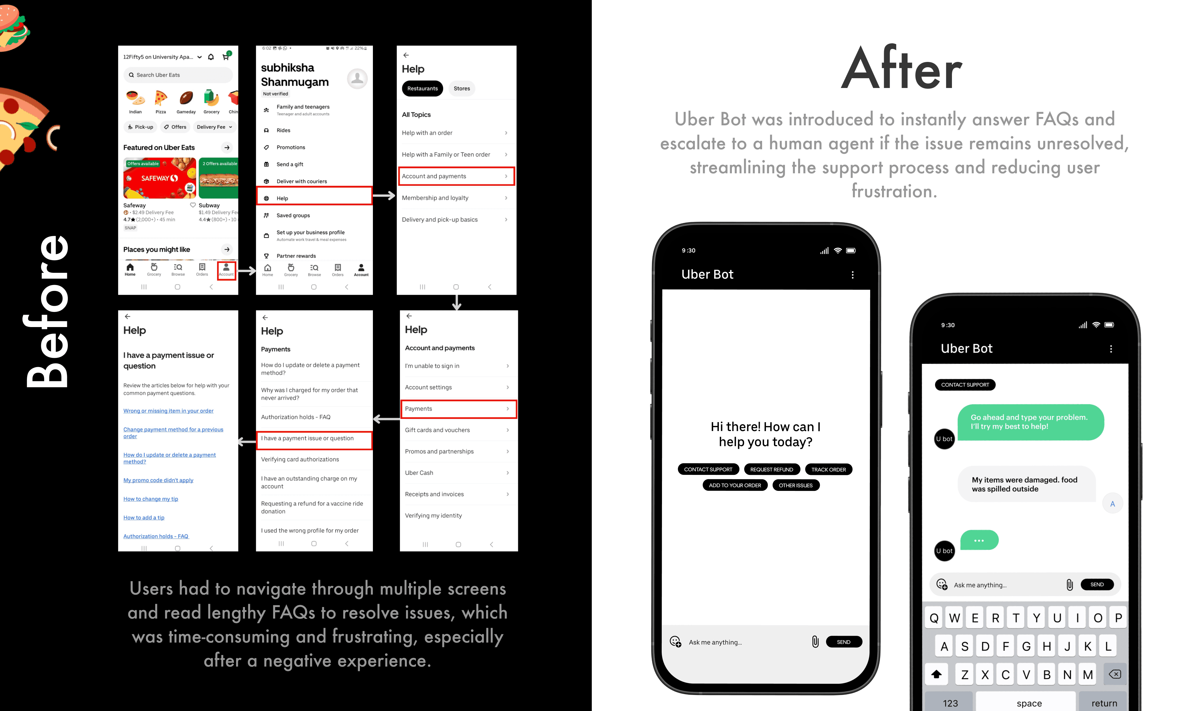
5 out of 6 found customer support frustrating, citing a complicated resolution process.
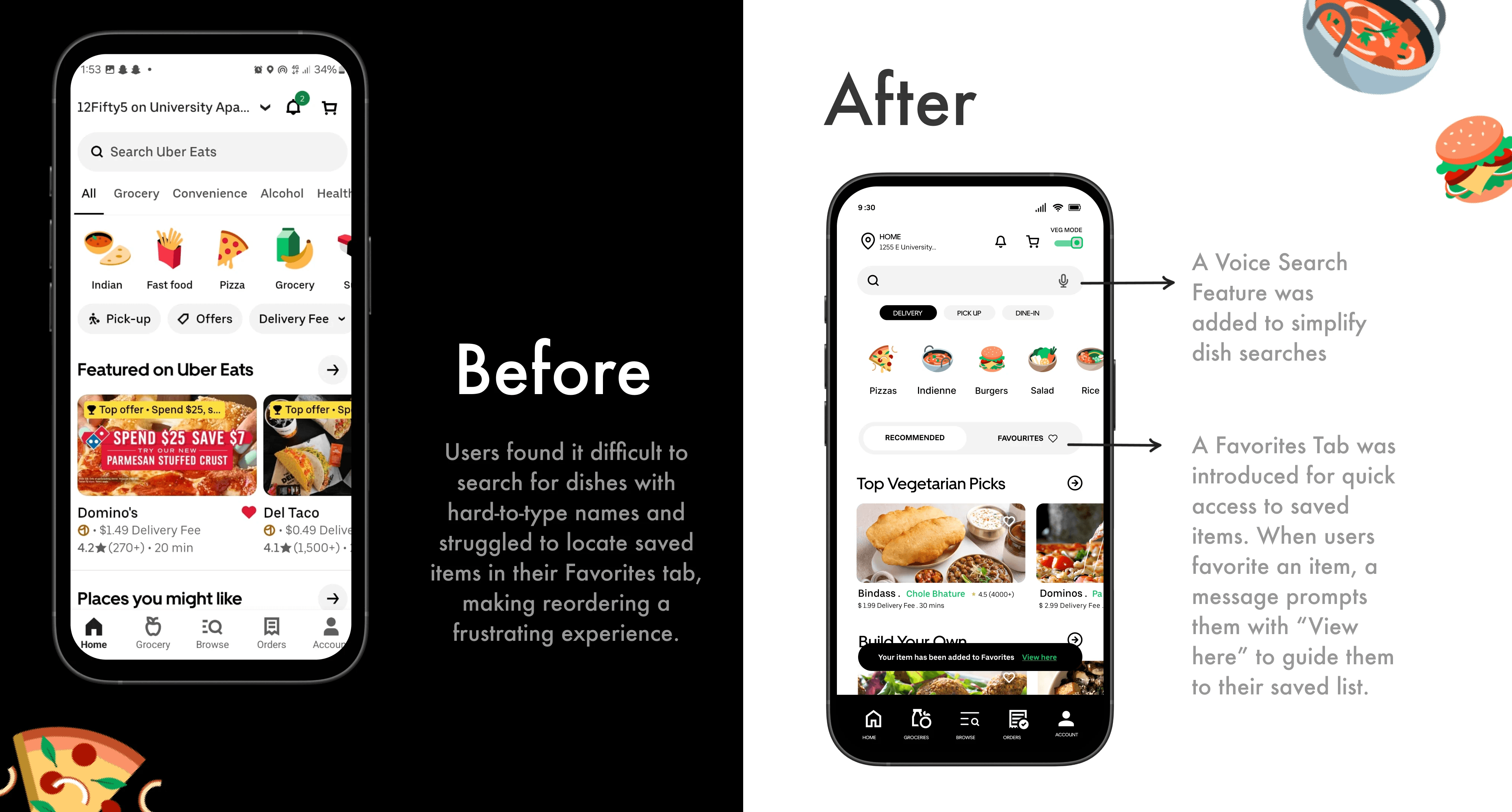
4 out of 6 had difficulty searching for dishes with hard-to-type names.
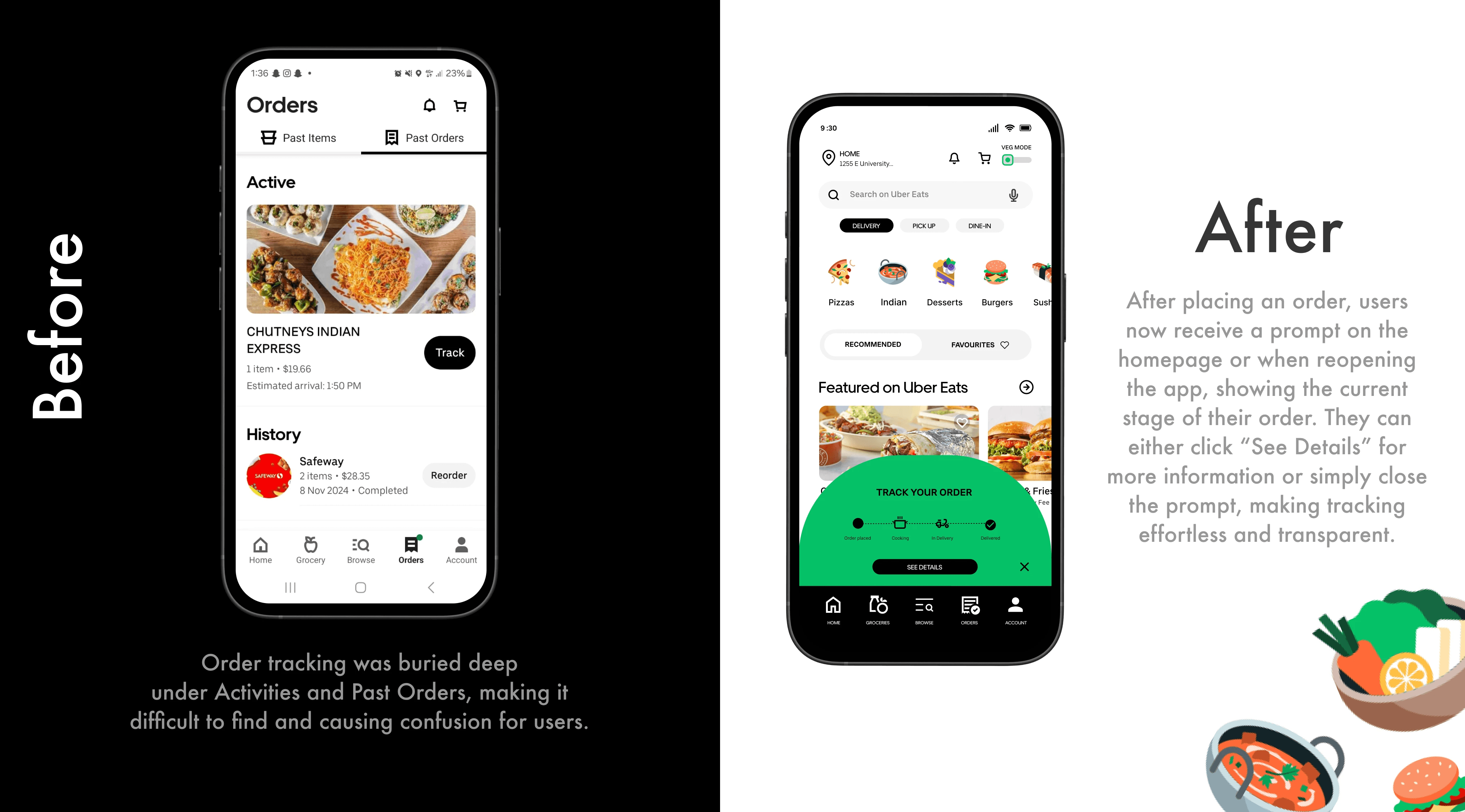
5 out of 6 found order tracking confusing, as it was buried deep in the app.
User Quotes
📌 A veg filter would save so much time."
📌 "I always lose track of my saved meals."
📌 "I ordered, waited for an hour, then found out it's out of stock."
📌 "Customer support is a nightmare to reach."
📌 "Voice search would make finding dishes way easier."
📌 "I have to dig through past orders just to check my delivery status.""
📌 "Why don't popular dishes appear as recommendations when searching within a restaurant?"
Defining the problem
Uber Eats users face multiple usability challenges that hinder their ordering process. This redesign aims to streamline navigation, simplify food discovery, and provide more accessible customer support and order tracking—ultimately creating a smoother, more efficient experience.
Pain points
Lack of filtering options make it difficult for vegetarians to find suitable meals.
Menu navigation is time-consuming, especially for vegetarian-friendly options.
Saved items are hard to find
Customer support is complex, requiring multiple steps to resolve issues.
Dish searches are frustrating due to difficult-to-type names.
Lack of smart recommendations makes decision-making overwhelming.
Order tracking is hidden within past orders, causing confusion.
Wireframes
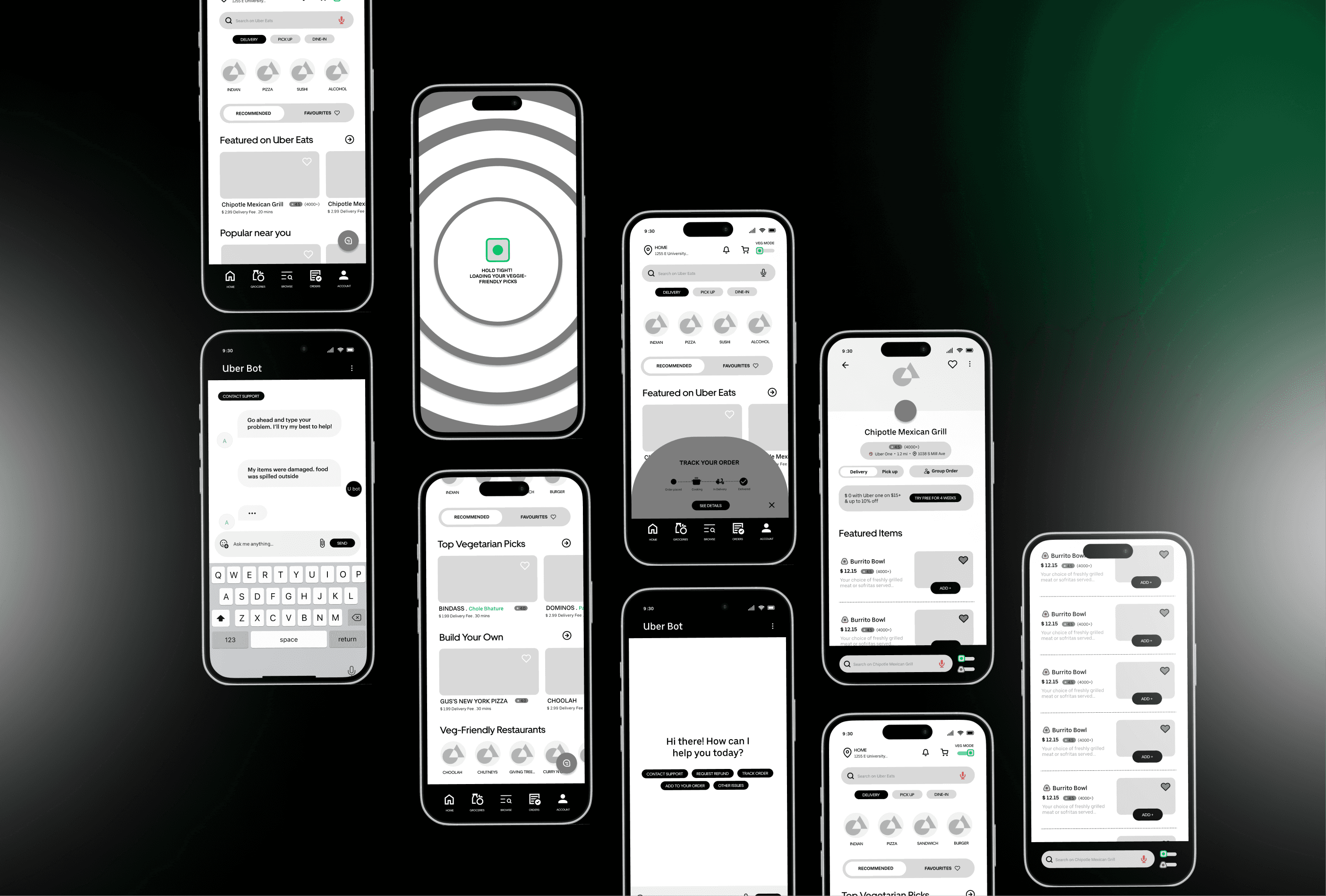
Based on these insights, I moved forward with designing the mid-fidelity wireframe, focusing on multiple iterations and micro-interactions. I explored transitions from the Uber Eats homepage to Veg Mode, experimented with a chatbot to address key user issues, and refined critical problem areas. Additionally, I introduced improvements such as a more prominent call-to-action button for adding items to enhance usability.
High Fidelity Wireframes
Building on the insights gathered from user research and mid-fidelity iterations, I developed high-fidelity wireframes to bring the redesigned Uber Eats experience to life. These wireframes focus on addressing key pain points while enhancing usability, accessibility, and visual appeal.
Major Design Iterations
To address the core usability challenges, I focused on key design iterations informed by user feedback. Each change was designed to enhance the overall experience, making the app more intuitive and user-friendly. Below is a breakdown of the improvements, supported by before-and-after visuals to highlight the impact.
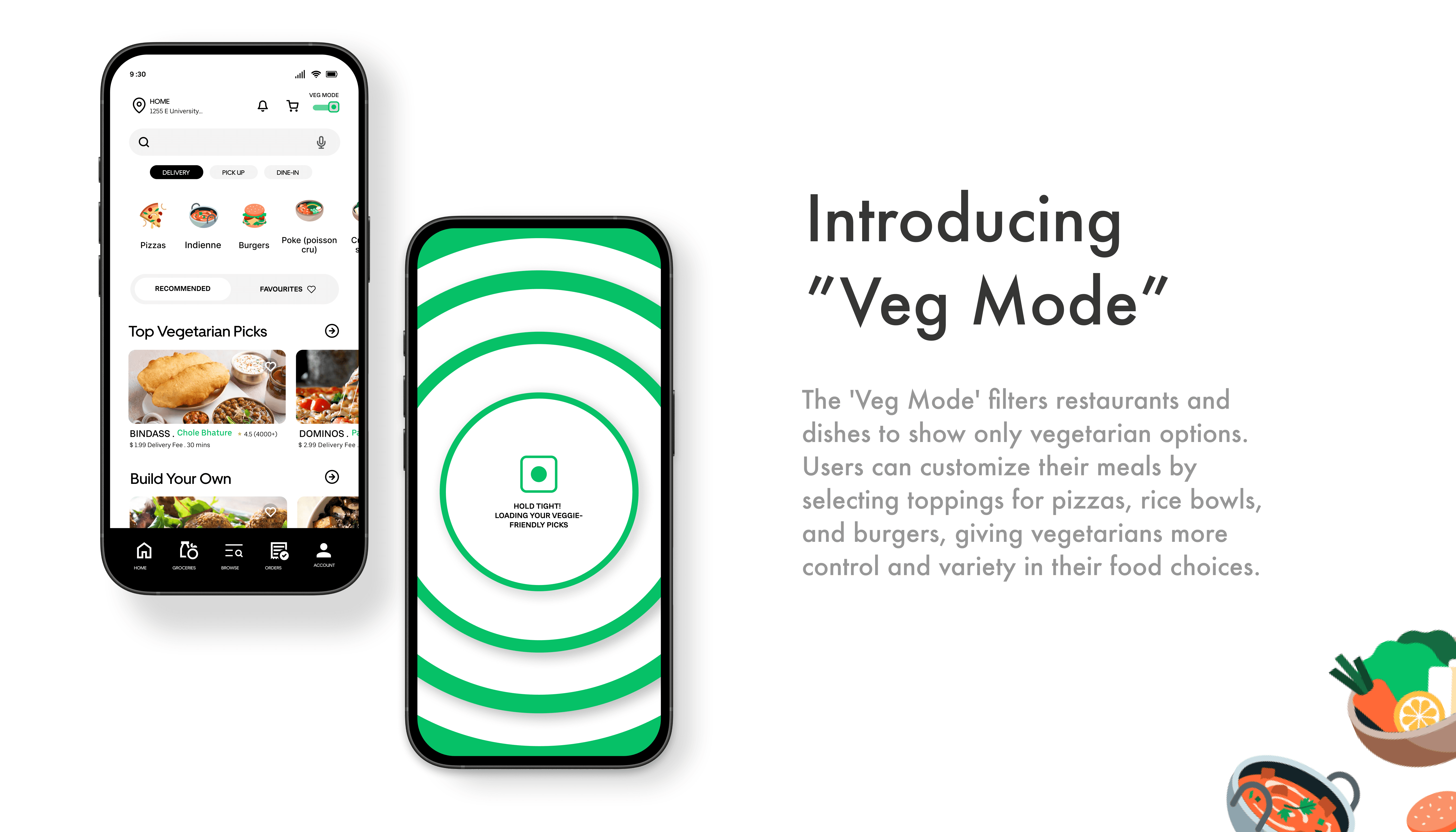
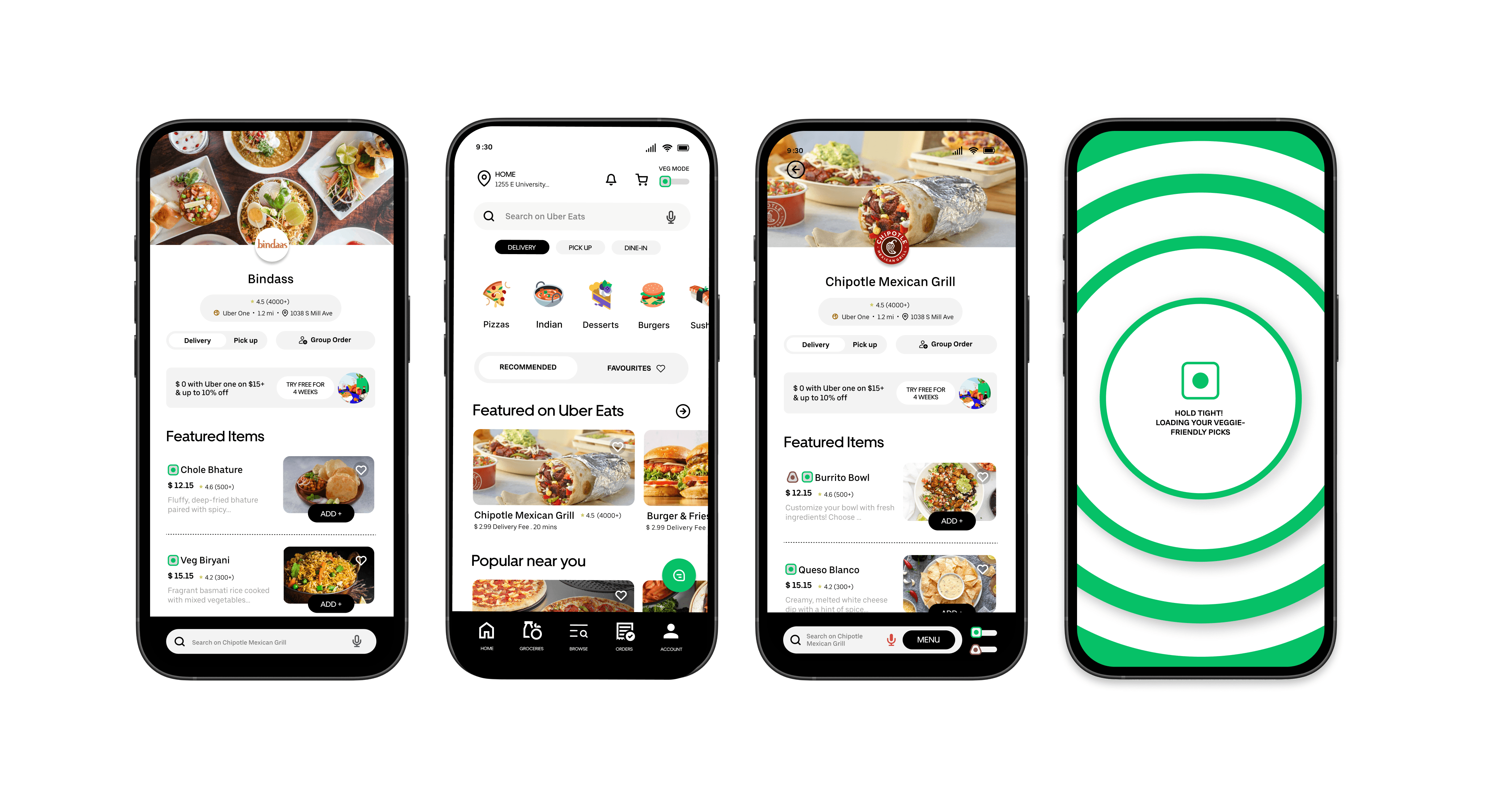
1. Introducing a Veg Filter
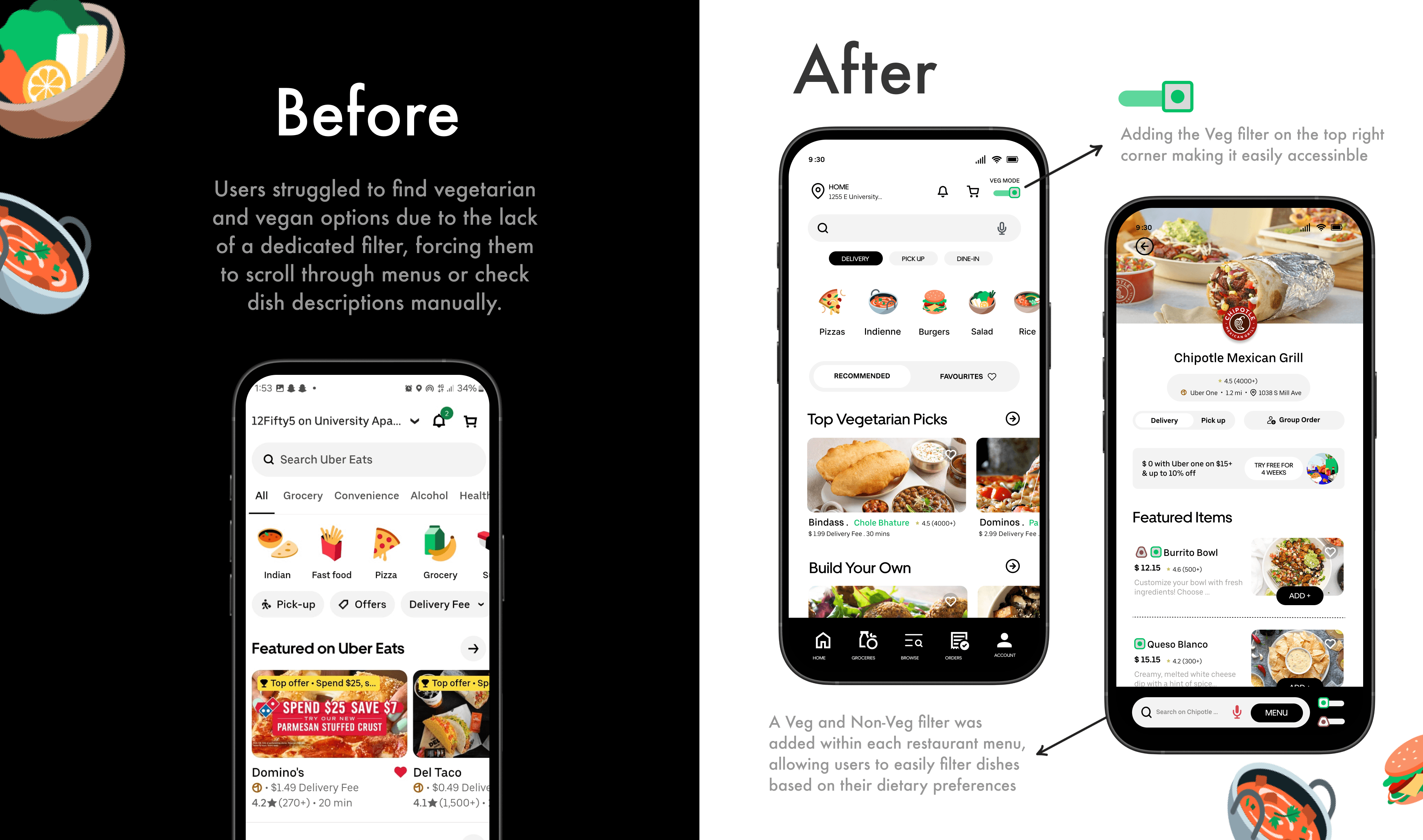
2. Search by Voice Feature and Favorites Tab
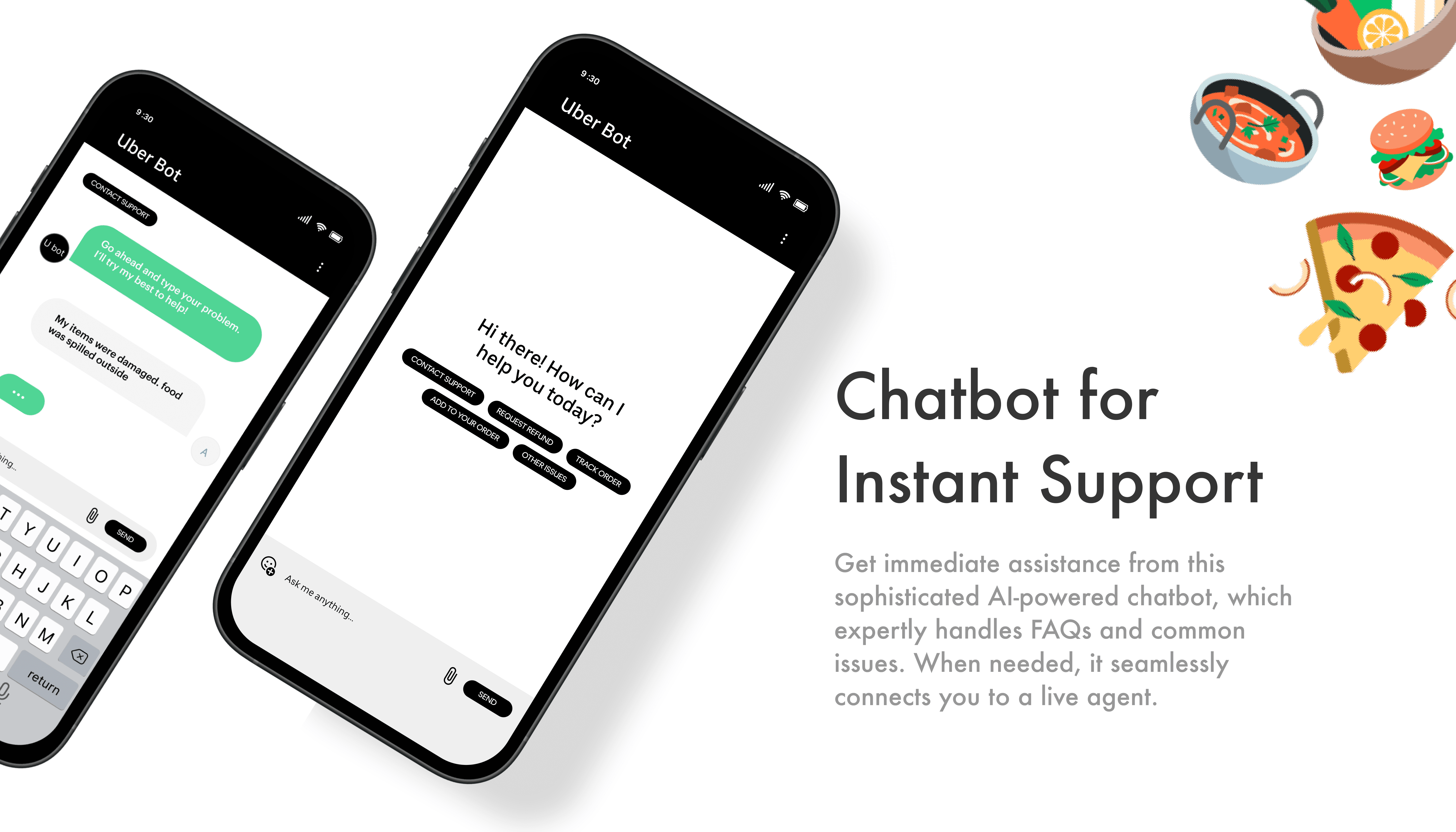
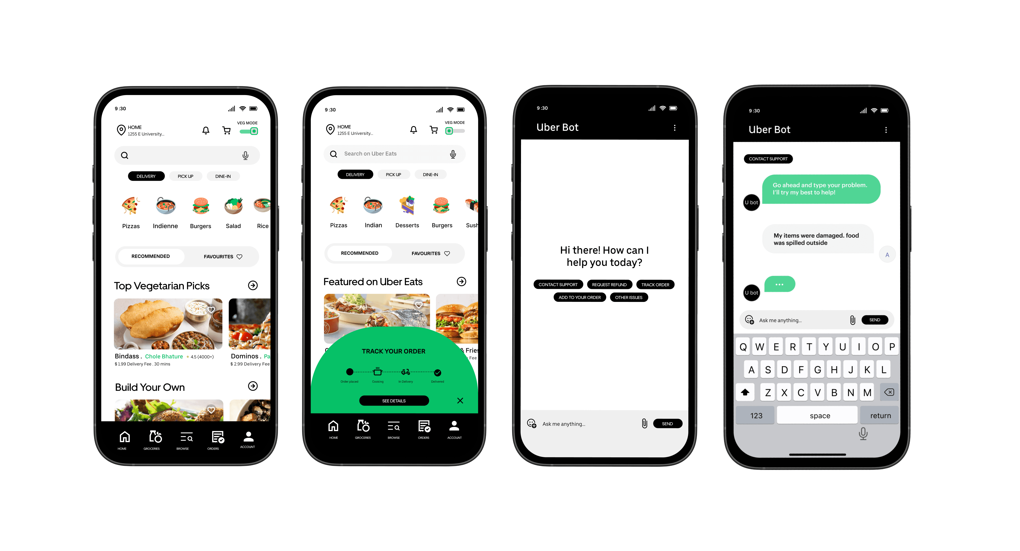
3. Adding a Chatbot for FAQs
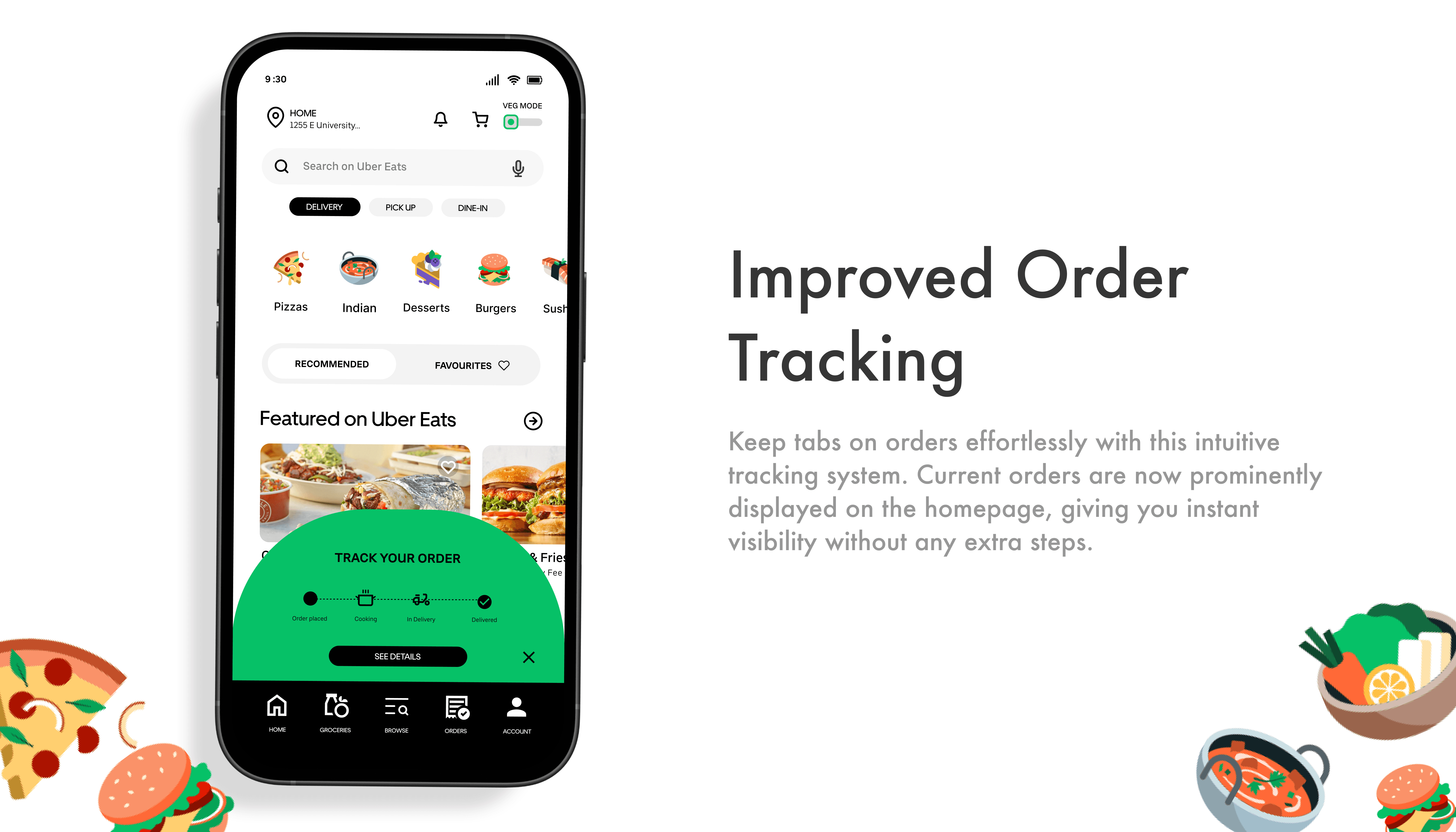
4. Making Order Tracking More Accessible
Conclusion
This redesign tackled key pain points like missing vegetarian filters, hidden order tracking, and frustrating support. By introducing Veg Mode, real-time tracking, Uber Bot, and Voice Search, the app now offers a smoother, more personalized experience.

Hi
Let’s build something impactful together
USER INTERVIEW
PROBLEM SOLVING
FIGMA
Uber Eats - Redesign
Tools :
Figma
Industry :
Tech
Project Duration :
SEPT 2024
Uber Eats - Redesign
Problem :
Uber Eats has developed a convenient food delivery platform that connects users with restaurants. However, the platform faces several usability challenges:
No vegetarian/vegan filter, lack of proper customer care solution issues, poor customer support,
and difficult-to-track saved items and orders.
These problems hinder the user experience, causing frustration and reducing customer satisfaction. As a result, Uber Eats cannot fully capitalize on its market potential and growth opportunities.
Problem :
Uber Eats has developed a convenient food delivery platform that connects users with restaurants. However, the platform faces several usability challenges:
No vegetarian/vegan filter, lack of proper customer care solution issues, poor customer support, and difficult-to-track saved items and orders.
These problems hinder the user experience, causing frustration and reducing customer satisfaction. As a result, Uber Eats cannot fully capitalize on its market potential and growth opportunities.
Solution:
After interacting with users, I realized many of them were facing similar frustrations that hindered their overall experience. To address these challenges, I designed a solution that improves food discovery, enhances customer support, and streamlines order tracking. The goal was to create a more seamless, user-friendly experience for those seeking a personalized and efficient way to order food.
Introduction
Uber Eats, a global food delivery platform, connects users with local restaurants via its app and website. As the second-largest food delivery service in the U.S., it had 11.22 million downloads in 2023, compared to 21.11 million for DoorDash. With the industry projected to reach $213 billion by 2030, Uber Eats aims to enhance convenience, personalization, and innovation to drive growth.
Scope of the Project
This project focuses on improving the user experience (UX) of the Uber Eats app, making it more accessible, intuitive, and user-friendly for a diverse audience.
Competitor Analysis :
A competitor analysis was conducted to identify areas where Uber Eats can improve by leveraging industry best practices. This comparison provided insights into key strengths and weaknesses across competing platforms.
User Persona
Based on the research, I identified two distinct user personas:
A vegetarian international student who needs quick meals but has difficulty locating saved items in favorites because of an inefficient filtering system.
A U.S. citizen who enjoys exploring diverse cuisines but struggles to pronounce dish names and track orders efficiently in the app.
User Interviews
Six participants (ages 21–27), including students and working professionals, were interviewed to understand their food delivery experiences. Their feedback revealed key pain points and areas for improvement.
Key Findings
5 out of 6 struggled to find vegetarian options due to the lack of a veg/vegan filter.
4 out of 6 found saved items difficult to locate when reordering.
3 out of 6 faced order availability issues, receiving cancellations after long wait times.
5 out of 6 found customer support frustrating, citing a complicated resolution process.
4 out of 6 had difficulty searching for dishes with hard-to-type names.
5 out of 6 found order tracking confusing, as it was buried deep in the app.
User Quotes
📌 A veg filter would save so much time."
📌 "I always lose track of my saved meals."
📌 "I ordered, waited for an hour, then found out it's out of stock."
📌 "Customer support is a nightmare to reach."
📌 "Voice search would make finding dishes way easier."
📌 "I have to dig through past orders just to check my delivery status.""
📌 "Why don't popular dishes appear as recommendations when searching within a restaurant?"
Defining the problem
Uber Eats users face multiple usability challenges that hinder their ordering process. This redesign aims to streamline navigation, simplify food discovery, and provide more accessible customer support and order tracking—ultimately creating a smoother, more efficient experience.
Pain points
Lack of filtering options make it difficult for vegetarians to find suitable meals.
Menu navigation is time-consuming, especially for vegetarian-friendly options.
Saved items are hard to find
Customer support is complex, requiring multiple steps to resolve issues.
Dish searches are frustrating due to difficult-to-type names.
Lack of smart recommendations makes decision-making overwhelming.
Order tracking is hidden within past orders, causing confusion.
Wireframes
Based on these insights, I moved forward with designing the mid-fidelity wireframe, focusing on multiple iterations and micro-interactions. I explored transitions from the Uber Eats homepage to Veg Mode, experimented with a chatbot to address key user issues, and refined critical problem areas. Additionally, I introduced improvements such as a more prominent call-to-action button for adding items to enhance usability.
High Fidelity Wireframes
Building on the insights gathered from user research and mid-fidelity iterations, I developed high-fidelity wireframes to bring the redesigned Uber Eats experience to life. These wireframes focus on addressing key pain points while enhancing usability, accessibility, and visual appeal.
Major Design Iterations
To address the core usability challenges, I focused on key design iterations informed by user feedback. Each change was designed to enhance the overall experience, making the app more intuitive and user-friendly. Below is a breakdown of the improvements, supported by before-and-after visuals to highlight the impact.
1. Introducing a Veg Filter
2. Search by Voice Feature and Favorites Tab
3. Adding a Chatbot for FAQs
4. Making Order Tracking More Accessible
Conclusion
This redesign tackled key pain points like missing vegetarian filters, hidden order tracking, and frustrating support. By introducing Veg Mode, real-time tracking, Uber Bot, and Voice Search, the app now offers a smoother, more personalized experience.
Hi